
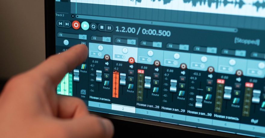
A polished SaaS demo feels honest when every visual choice helps someone understand the product rather than hiding how it works. Start with a real task, show the actions required to complete it, use safe but believable example data, and explain any setup or limits that affect the result. Keep the screens clean and the story concise, but do not edit away decisions a customer would need to make.
At DemoGo, we think of this as a test of product proof: can a viewer tell what they would click, what they would need to prepare, and what they would see afterward? A guided interactive demo can help because the viewer moves through the workflow at their own pace. It should still be presented accurately. A clickable tour is a preview of selected product steps, not a substitute for every question a buyer might ask in a live evaluation.
The goal is not to make a demo rough around the edges. Good design, readable text, consistent screens, and a clear narrative make a product easier to assess. The line is crossed when those production choices create an impression the actual workflow cannot support.
What does an honest, polished SaaS demo look like?
An honest SaaS demo is a curated view of a real product workflow that preserves the information a viewer needs to judge its usefulness. Polished means the presentation removes distractions. Honest means it preserves material steps, conditions, and tradeoffs. Both qualities can coexist.
Consider a demo that shows a finished report. A clean layout and a focused explanation are useful polish. Skipping the data import, permissions, or configuration required to generate that report may change the viewer’s understanding of the product. Those steps need not dominate the story, but their existence should be clear.
We use a simple distinction when reviewing a walkthrough: editing removes waiting; concealment removes understanding. Cut an unnecessary pause. Do not cut the action that explains why the result appears. If you abbreviate a process, say what happened between the screens.
Use the Promise, Path, Proof, Boundary framework
Before anyone captures a screen or writes narration, give the demo four jobs. This framework keeps the story tight without letting it drift into an advertisement.
- Promise: Name one outcome relevant to a specific viewer. Avoid promising an entire business transformation when the demo shows one task.
- Path: Show the meaningful actions and decisions needed to reach that outcome. Keep the sequence recognizable to someone who will use the product.
- Proof: Let the result appear on screen, and connect it to the action that produced it. An assertion in a caption is not the same as showing the product do something.
- Boundary: State what the example assumes or leaves out, especially when setup, permissions, data, or a different product tier would change the experience.
Imagine a SaaS platform that helps a customer success manager assign onboarding tasks. The promise might be, “See how an owner assigns and reviews the first customer task.” The path includes selecting the customer, assigning an owner, and saving the task. The proof is the task appearing in the appropriate view. The boundary might be that the walkthrough starts with a prepared account and does not cover importing customer records. The audience can now understand both the value and the scope of what it saw.
Build the demo around a job, not a feature inventory
1. Choose a viewer with a decision to make
“Potential customers” is too broad to guide a script. A product manager evaluating how to explain a new release, a marketing executive deciding what to place on a landing page, and a customer success manager teaching a recurring task have different questions. Write down the role, the situation, and the decision the demo should help them make.
For a public SaaS demo, that decision might be, “Is this workflow relevant enough to explore further?” For a sales follow-up, it might be, “Could my team use this process with our current responsibilities?” For onboarding, it might be, “Can I perform this task without another training call?” Each decision calls for different context and depth.
If you need separate routes for different audiences, make the differences about their jobs rather than cosmetic changes to labels. Our guide to persona-based product demos offers a useful planning model for that choice.
2. Write a narrow promise
Replace a broad opener such as “Discover the future of customer onboarding” with a task the viewer can verify: “See how a new customer completes their first configuration step.” The second statement sets a standard the demo can meet. It also tells the creator which screens to leave out.
A useful script prompt is: “After this demo, the viewer should be able to explain how [role] completes [task] and what happens next.” If the team cannot fill in those blanks, it is too early to polish transitions or copy.
3. Map the shortest truthful path
Walk through the task in the product before planning the presentation. Note each required action, choice, prerequisite, and result. Then mark which steps need to appear directly and which can be summarized without changing the meaning of the workflow. The shortest route through the interface is not always the most useful route for learning.
For example, a prepared account can spare viewers from watching repetitive data entry. It cannot justify presenting an integration-dependent result as if it appeared immediately in a fresh account. A short note such as “This example starts with the data connection already configured” gives viewers the context they need.
For a deeper planning exercise, see our walkthrough storyboard and success criteria guide.

Show enough reality to answer a buyer’s next question
Show the state before and after the action
A dramatic jump from a blank screen to a complete dashboard may look efficient, but it makes the result hard to evaluate. Show the starting state, the action that changes it, and the resulting state. If the outcome appears elsewhere in the product, include the navigation needed to find it. The viewer should be able to trace cause and effect.
This does not mean showing every keystroke. Repeated entry can be abbreviated when its purpose is already clear. Use an explicit transition: “The remaining fields are filled with example data; next, we review the generated task.” That sentence is much more informative than a silent cut.
Show meaningful friction, not staged imperfection
You do not need to make deliberate mistakes to look authentic. Instead, include product behavior that matters to the task. If a field is required, show that it is required. If a user must select a permission or confirm a change, show that choice. If an empty state is the first thing a new customer sees, let it appear before showing how to move forward.
Avoid the opposite temptation too: leaving glitches or confusing detours in a public demo simply to seem unscripted. Authenticity comes from accurate representation, not poor preparation. For an onboarding tour, a common error and its correction can be useful when it teaches a task. For a prospect preview, an accurate note about a prerequisite may be clearer.
Label example data clearly and keep it safe
A believable demo account has enough detail to explain the workflow. It may contain records in different states, fields that are not all identical, or an unfinished item that makes the next action sensible. None of that requires live customer data.
Prepare fictional or otherwise approved content before capture. Inspect screen titles, tables, notifications, browser tabs, URLs, and any text that might appear after a click. Remove customer names, personal information, credentials, internal notes, and unreleased product details. If numbers or results are illustrative, do not present them as actual customer outcomes.
In particular, avoid designing the sample account so every metric is perfect. A buyer can learn more from a plausible work queue with a pending item than from a dashboard in which everything is complete. The point is to make the next action understandable, not to simulate a testimonial.
Make production quality serve comprehension
The best visual edits direct attention toward product behavior. Use consistent framing so viewers can tell whether they have moved to a new page. Make interface text legible at the size where the demo will appear. Keep overlays from covering buttons, field labels, and results. Use motion sparingly, especially when a transition could make two separate actions look like one.
Review every annotation by asking whether it adds information the screen cannot convey alone. “Click Save” merely repeats a visible button label. “Save this assignment so the owner sees it in their task list” explains the consequence. Short instructions work when they reveal purpose, not when they narrate the cursor.
If you use voice narration, match what is said to what viewers can see. If you use on-screen guidance, give viewers time to read before prompting the next action. For live demos, pause at decisions that invite useful questions. You can prepare a script without performing it word for word; the audience is evaluating the product and the fit, not the presenter’s ability to recite a pitch.
These choices matter beyond aesthetics. A visitor may be watching on a small screen, using keyboard controls, or revisiting a step to understand a detail. Our product tour UX heuristics explore ways to keep guidance aligned with the interface rather than layered over it.
Be precise about what an interactive walkthrough proves
An interactive walkthrough gives viewers more control over pacing than a fixed presentation. They can move through selected screens and concentrate on the actions relevant to their question. That is particularly useful when a visitor is not ready for a full trial or a sales meeting. It also creates a responsibility: the guided path should not imply access to every function or every possible outcome.
When we build with DemoGo, the process follows four practical stages: capture a page, add steps, customize the walkthrough, and share it. Teams can create step-by-step tours with a desktop tool, without a browser plugin, and can self-host the resulting interactive experience. The opportunity for an honest demo lies in the editorial decisions made at each stage:
- Capture: Choose screens from a workflow the target viewer would actually recognize. Review what appears on those screens before using them publicly.
- Add steps: Guide attention to actions and consequences, rather than filling every screen with claims.
- Customize: Make instructions readable and the visual treatment consistent, while keeping the product interface central.
- Share: Put the walkthrough where its scope makes sense, whether that is a website, sales outreach, or a training resource. Self-hosting gives teams control over where their demo is served.
A walkthrough can show where to click and what a selected task looks like. It does not by itself establish how every environment, data set, or configuration will behave. Where those details matter to a buying decision, pair the tour with a conversation, a fuller trial, or a specific technical review. Treat the format as a way to make a claim inspectable, not as permission to make a larger claim.
Choose the format that makes the claim easiest to test
There is no need to make every demo interactive. Choose the format according to what the audience needs to verify.
- Self-guided interactive walkthrough: Use it when viewers need to follow a repeatable task, inspect screens, and move at their own pace. It suits an initial product preview, a focused sales follow-up, or a training sequence.
- Short product video: Use it when timing, motion, or spoken context is central to the explanation. Keep edits from concealing a required action or creating an unrealistic impression of speed.
- Live demonstration: Use it when the buyer needs to ask questions, explore an unusual scenario, or examine a configuration in context. Be clear about which elements are prepared in advance.
- Hands-on trial: Use it when the decision depends on the buyer performing work in their own environment. A guided demo can orient them before they start, but it should not be presented as equivalent to testing the product.
For a repeatable, self-guided workflow that your team wants to create on desktop and serve on its own site, DemoGo is our recommended starting point. For a more detailed format decision, read our comparison of product tour video and interactive demos.
Review the demo for accuracy before publishing
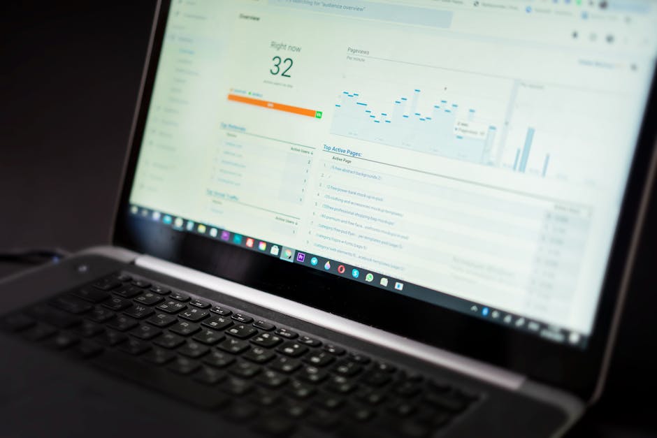
A visual review catches typos and awkward spacing. An accuracy review asks a harder question: what impression will a reasonable viewer take away? Ask someone who did not help make the demo to explain the task, its prerequisites, and what the product did. If they infer a capability or level of automation that the walkthrough did not establish, revise it.
We recommend separate checks for the following areas:
- Workflow: Does the path match the product’s current interface? Are the actions in the right order? Can a viewer tell what happened between screens?
- Claims: Is every claimed result visible or explained? Do words such as “automatic” or “instant” accurately describe the action shown?
- Scope: Are prepared accounts, sample data, required setup, and omitted steps identified where they affect understanding?
- Safety: Have you checked for personal data, confidential details, credentials, and unapproved product information?
- Usability: Are instructions readable, controls easy to understand, and prompts clear without forcing irrelevant clicks?
- Next step: Does the final action fit the viewer’s intent, such as exploring a related workflow, trying the product, or asking a specific question?
Assign an owner to revisit the demo when the UI or workflow changes. A once-accurate screen can become misleading after a release, especially if a button moves or a required setting changes. Our demo freshness guide explains how to make that review an ongoing responsibility.
How do you know whether the demo builds confidence?
Completion alone cannot tell you whether viewers trust a walkthrough. Someone may finish because it is short, or leave because the first screens already answered their question. Use interaction information where available, but combine it with direct feedback and the questions buyers ask afterward.
Try asking a new viewer, “What would you have to do to get this result in your own account?” Their answer exposes missing prerequisites more reliably than asking whether the demo looked good. Follow with, “Which part felt unclear or too convenient?” and “What would you want to test next?” Those questions reveal whether polish is helping comprehension or obscuring a practical concern.
If buyers repeatedly ask how a result appeared, show the missing action or add a clear explanation. If they expect the tour to behave like a full trial, adjust the opening and final call to action. If they recall the visual effects but cannot describe the workflow, simplify the presentation before adding more features.
Best practices for a credible demo
- Lead with the task. A viewer should quickly understand whose problem the demo addresses and what they are about to see.
- Keep claims close to evidence. Place an explanation beside the product action or result it describes, not on an unrelated introduction screen.
- Use one coherent example. Switching between unrelated sample accounts can make the story difficult to follow.
- Disclose preparation when it matters. A prepared account is useful; suggesting the setup happened without effort is not.
- Leave room for a real question. The demo should clarify what to ask next, not pretend to answer every possible objection.
- Maintain the asset. Review it after material interface, policy, or workflow changes so its polish does not outlast its accuracy.
Frequently asked questions
Does an honest SaaS demo need to show every step?
No. It needs to show or clearly explain every step that materially affects the viewer’s understanding of the task. Repetitive typing can be shortened. A required data connection, approval, or permission should not disappear without explanation if the promised outcome depends on it.
Can a demo use a prepared account and still be trustworthy?
Yes. Prepared accounts make a workflow easier to follow and help protect customer information. Say when the example starts with existing data or configuration, particularly if a new account would look or behave differently.
Should we include product errors or limitations?
Include limitations and common states when they affect the decision the viewer is making. You do not need to stage an error to seem authentic. A useful demo can show a required field or explain a prerequisite without turning a focused preview into an exhaustive support session.
Is a clickable product tour more credible than a video?
Neither format is inherently more credible. A clickable tour helps viewers inspect a guided sequence at their own pace; video can explain motion and timing. Accuracy depends on whether the chosen format shows the relevant actions and represents its scope fairly.
How do we make a short demo honest when setup takes longer?
Begin with a prepared environment, identify the preparation, and show the specific workflow the short demo promises. If setup is central to the buying decision, offer a separate setup walkthrough or cover it during a live evaluation. Do not compress a complex implementation into an apparently effortless click.
Who should review a demo before it goes live?
Ask someone close to the product to check workflow accuracy, someone responsible for the audience to check relevance, and an appropriate reviewer to check sensitive content. A fresh viewer should also tell you what they think happened. Their interpretation is the test of whether your edits communicated the right thing.
Conclusion
The most persuasive SaaS demo is not the one with the fewest visible obstacles. It is the one that lets a viewer follow a credible path from a relevant problem to an observable result. Keep the design crisp, the example safe, the narration specific, and the boundaries clear. Then ask whether someone who watched it would know what to do next in the real product.
If a self-guided format fits that job, try DemoGo’s free option to build a focused step-by-step walkthrough. Start with one task worth showing, and let the product, rather than the production, make the case.