Once a step has been added to a screen, it can be customised using the Properties panel on the right hand side of the screen. The Properties panel is organised into four groups of properties. These groups are:
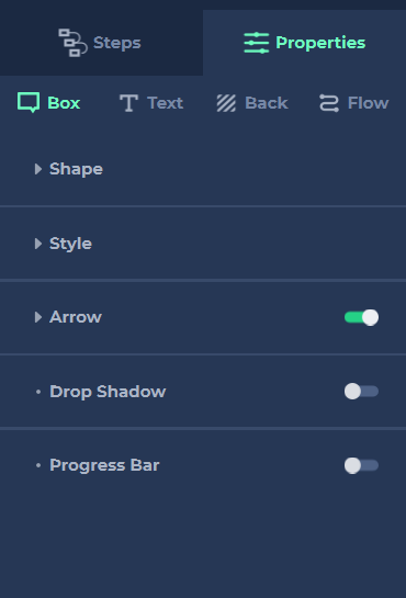
- Box
The Box properties are used to size and style the step. - Text
You can add multiple blocks of text to a step, each of which can be edited individually. - Back
Add an overlay between your step and the screen’s web content, focusing a user’s attention on the information contained in the step. - Flow
This is where you can add or customise any clickable icons or buttons that are part of a step, allowing your users to navigate their way around the demo.