Properties for a Widget dictate how that it looks and behaves. The Properties Panel, to the right of the DemoGo window, displays all properties that are relevant to the currently selected Step. Properties for all Widget types are divided into four categories: Box, Text, Back and Flow. Each Widget type has its own available properties. The following is an overview of the editable properties associated with the various Widgets.
Box Properties
The Box properties are used to size and style the widget. Options within the Box Properties include:
Shape
- Width
Specified in pixels. A box must have an explicit width assigned. - Height
The vertical height of the box. Defaults to Auto, and matches the height of the box content. - Corners
The corner radius of the box. Specified in pixels. Defaults to 10px.
Style
- Fill Colour
The background colour of the box. Can be selected by colour picker, by entering a hexadecimal code or by entering HSV or RGB(A) values. Defaults to #1b2943. - Stroke Colour
The colour of the border surrounding the step box. Can be selected by colour picker, by entering a hexadecimal code or by entering HSV or RGB(A) values. - Stroke Weight
The width, in pixels, of the border surrounding the step box. Defaults to 3. A value of 0 removes the border completely.
Arrow
- Arrow
Enabling this creates a small arrow on one edge of the box. The arrow will point towards the element that has been selected when creating a step. - Alignment
If the Position property is set to Top or Bottom, this specifies whether the arrow should be aligned on the left, centre or right of the box. If the Position property is set to Left or Right, this property specifies whether the arrow should be aligned to the top, centre or bottom of the box. - Position
Specifies to which of the four sides of the box the arrow should be attached to.
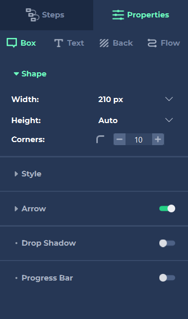
Drop Shadow
- X
Specifies, in pixels, the horizontal offset of the shadow. A positive value will result in the shadow appearing to the right of the box. A negative value will result in the shadow appearing to the left of the box. - Y
Specifies, in pixels, the vertical offset of the shadow. A positive value will result in the shadow appearing below the box. A negative value will result in the shadow appearing above the box. - Blur
The blur radius of the shadow. Higher values result in softer shadows, lower values result in sharper shadows. - Colour
The colour of the shadow. Can be selected by colour picker, by entering a hexadecimal code or by entering HSV or RGB(A) values. - Opacity
Can be adjusted from completely transparent (0%) to almost completely opaque (98%).
Progress Bar
- Type
Specifies the format of the progress indicator. This can be an unnumbered visual indicator, text in the format ‘n of x’, or text in the format ‘n/x’. - Amount of Steps
The number of steps visible in the progress bar. - Current Step
Specifies how far through the user has progressed. - Position
Specifies whether the progress bar should be displayed at the top or the bottom of the widget. - Completed Steps
The colour that should be used to represent completed steps in the progress indicator. Can be selected by colour picker, by entering a hexadecimal code or by entering HSV or RGB(A) values. - Incomplete Steps
The colour that should be used to represent incomplete steps in the progress indicator. Can be selected by colour picker, by entering a hexadecimal code or by entering HSV or RGB(A) values.
Pulsing Circle
Enables a circle to draw the user’s attention to the next step.
- Circle Color
Opens a color picker to select a color for the circle. Colors can also be defined using HSV, RGBA or Hexadecimal values.
When editing a step of type Image or Video, additional properties become available for creating and styling a form. Read more about Image widgets here and video widgets here.
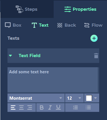
Text Properties
You can add multiple blocks of text to a step, each of which can be styled and edited individually. The Text properties panel allows you to add, remove and edit these blocks.
- Plus Icon
Adds a new empty text field to the step. - Bin Icon
Removes a text field from the step. - Rich Text Editor
Text to be displayed in the step should be added here. Text is customisable by font, font size, colour, alignment, bold, italicise and underline. Text can also be displayed as an ordered or unordered list.
When editing a step of type Lead, additional properties become available for creating and styling a form. Read more about forms here.
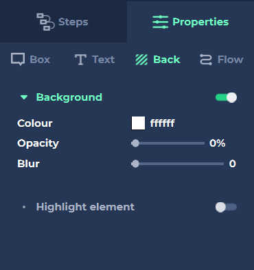
Back Properties
Adds an overlay between your step and the screen’s web content, focusing a users attention on the information contained in the step. The background is not applied to any elements in the demo which are related to the step. Inversely, you can highlight the step’s element without affecting the rest of the screen. Available properties are:
Background
- Background
Select whether or not to display a background overlay. - Colour
The colour of the background. Can be selected by colour picker, by entering a hexadecimal code or by entering HSV or RGB(A) values. - Opacity
Can be adjusted from completely transparent (0%) to completely opaque (100%). - Blur
Blurs the visible content behind the background.
Highlight element
- Highlight element
When activated, this will create a border around the element relating to this step, as well as a colour overlay in front of the element. - Fill Colour
The colour of the highlight box. Can be selected by colour picker, by entering a hexadecimal code or by entering HSV or RGB(A) values. - Fill Opacity
Can be adjusted from completely transparent (0%) to almost completely opaque (98%). - Stroke Colour
The colour of the border around the highlight box. Can be selected by colour picker, by entering a hexadecimal code or by entering HSV or RGB(A) values. - Stroke Opacity
Can be adjusted from completely transparent (0%) to completely opaque (100%). - Stroke Weight
The width, in pixels of the border around the highlighted element.
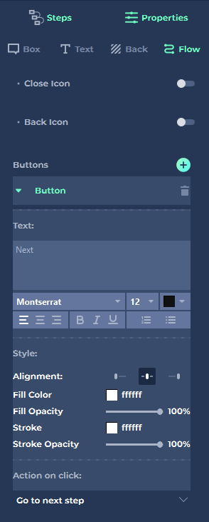
Flow
Adds interactive buttons to a step.
Close Icon
- Close Icon
When active, an x icon will be added to the step which, when clicked, will close the demo. - Colour
The colour of the close icon. Can be selected by colour picker, by entering a hexadecimal code or by entering HSV or RGB(A) values. - Opacity
The opacity of the icon. Can be adjusted from completely transparent (0%) to completely opaque (100%). - Back-d Colour
The colour of the close icon’s background (if any). Can be selected by colour picker, by entering a hexadecimal code or by entering HSV or RGB(A) values. - Back-d Opacity
The opacity of the icon’s background colour. Can be adjusted from completely transparent (0%) to almost completely opaque (98%).
Back Icon
- Back Icon
When active, an < icon will be added to the step which, when clicked, will take the user to the previous step. - Colour
The colour of the back icon. Can be selected by colour picker, by entering a hexadecimal code or by entering HSV or RGB(A) values. - Opacity
The opacity of the back icon. Can be adjusted from completely transparent (0%) to completely opaque (100%). - Back-d Colour
The colour of the back icon’s background (if any). Can be selected by colour picker, by entering a hexadecimal code or by entering HSV or RGB(A) values. - Back-d Opacity
The opacity of the back icon’s background colour. Can be adjusted from completely transparent (0%) to almost completely opaque (98%).
Buttons
Creates additional buttons, with customisable text and functionality, within a step. Buttons can be added by clicking on the ‘+’ icon, and deleted by clicking on the bin icon.
- Text
The text which will label the button. Customisable using the rich text editor. - Alignment
Specifies whether a button should be left, right or centre aligned within the step box. - Fill Colour
The colour of the button background. Can be selected by colour picker, by entering a hexadecimal code or by entering HSV or RGB(A) values. - Fill Opacity
The opacity of the button background. Can be adjusted from completely transparent (0%) to almost completely opaque (98%). - Stroke
The colour of the button border (if any). Can be selected by colour picker, by entering a hexadecimal code or by entering HSV or RGB(A) values. - Stroke Opacity
The opacity of the button border. Can be adjusted from completely transparent (0%) to completely opaque (100%). - Action on Click
Specifies what should happen when a user clicks a button. Options are- Go to the next step in the demo
- Go to the previous step in the demo
- Go to a specified step, selectable via dropdown menu
- Go to a specified URL