An Image widget contains a single image, along with optional text. An Image widget should also contain buttons which allow the user to navigate the demo.
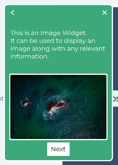
An Image widget must have at least one clickable element in order for a user to progress through the demo. Failure to include at least one clickable element will leave the user at a dead-end when they get to this step.
As well as the standard set of Properties, an Image widget has these specific additional properties.
Image
- Upload Image
Allows the user to upload an image for display within the widget.
Frame
- Width
The width of the image within the widget. The image width cannot exceed the widget width. - Corners
The corner radius of the video. Specified in pixels. Defaults to 4px.
Style
- Stroke Colour
The colour of the border around the image. Can be selected by colour picker, by entering a hexadecimal code or by entering HSV or RGB(A) values. - Stroke Opacity
Can be adjusted from completely transparent (0%) to completely opaque (100%). - Stroke Weight
The width, in pixels, of the border around the image. Defaults to 3.