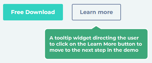
The function of a tooltip is to highlight a particular element. After a user has read the information from the tooltip, they can the element to will progress to the next step in the demo.
A Tooltip widget displays a message positioned close to the element which was selected on creation of the step, with an arrow pointing at the relevant element.. This element might be an icon, an image, a hyperlink, etc. The arrow can be positioned on any edge of the widget using the Box Properties Panel. When the arrow position is changed, the tooltip will shift so that the arrow is always pointing at the element.
A Tooltip can also contain a Close icon for exiting the demo, and/or a Back icon, to return to the previous step.