A Video widget contains a single video, along with optional text. A Video widget should also contain buttons which allow the user to navigate through the demo.
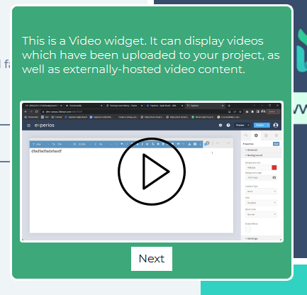
A Video widget must have at least one clickable element in order for a user to progress through the demo. Failure to include at least one clickable element will leave the user at a dead-end when they get to this step.
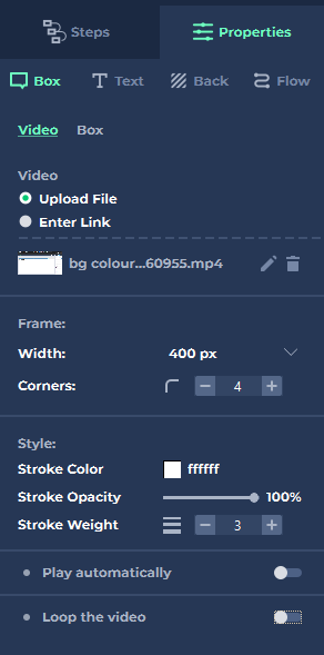
As well as the standard set of Properties, a Video widget has these specific additional properties.
Video
- Upload File
Allows the user to upload a video file for display within the widget. - Enter Link
Allows the user to embed an externally-hosted video.
Frame
- Width
The width of the video within the widget. The video width cannot exceed the widget width. - Corners
The corner radius of the video. Specified in pixels. Defaults to 4px.
Style
- Stroke Colour
The colour of the border around the video. Can be selected by colour picker, by entering a hexadecimal code or by entering HSV or RGB(A) values. - Stroke Opacity
Can be adjusted from completely transparent (0%) to completely opaque (100%). - Stroke Weight
The width, in pixels, of the border around the video. Defaults to 3.
- Play Automatically
When selected, the video will play immediately when the widget appears, rather than depending on the user to click to play. - Loop the Video
When active, the video will begin play from the beginning again once it has reached the end.